
I think we all agree that the days of having a manual for your system are long gone, much to the delight of many who would scoff at the thought of referring to a manual.
We all set out to make our systems easily discoverable, such that any person can jump on and just start using it. Many games incorporate learner-type stages that teach you the rules of the game in a hands-on way. Systems/apps will guide you through basic usability or new features through a startup slideshow or 'highlight bubbles' before you start using the app. Once you start using the app there may be a ‘Get started’ process/wizard to setup your site or account that guides you with helpful tips.
Every now and then you will find a function or page in the system that just requires a bit more instruction to the user to make sure they don’t screw it up. “Can we add help to the page?” clients ask. Sure we can, there are many options. But ‘help’ can be done well, and ‘help’ can also be a blight on your beautiful app. Here are some considerations when adding contextual help to your system.
Is my help helpful?
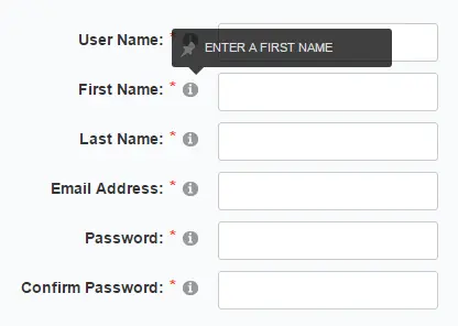
Too often I see dumb help, where a field such as ‘First name’ would have the help text of “Enter your first name.” You quickly give up looking at the help as you assume it is all similarly useless. Instead I like to have help only where it’s required, so users know that it’s worthwhile reading the help for this particular field or function.
How should I display my help?
Hovering over a field is being phased out as you generally can’t hover on phones and tablets. So when it comes to help for fields, we generally lean to help icons that can be clicked on or automatic help that appears when you enter a field. Having Help information automatically appear when you enter a field is helpful but can be annoying for a process that the user regularly does - they probably don’t need to see the help info after the 10th time they’ve filled out the form. Similarly with help icons, if there are a lot on the page they can become an eyesore for a regularly visited page.
For a frequently used page, a ‘Show help’ toggle on the page may be useful for new users, and means seasoned users don’t have help icons or information displayed on the page every time they visit.
Which type of help content is best for my system?
Will a couple of lines of free text suffice? Or does it require paragraphs of text, images, lists or links to external docs? I have the opinion that if we’re adding help to the page, it might as well be helpful. Seems obvious I know. Small amounts of help could easily fit beside the fields, whereas large amounts may be displayed better in a lightbox window that floats over the page.
There is of course help/Support areas of systems, but what I’m talking about here is contextual help on the page you’re on. In summary, contextual help still has a place in systems but we need to consider what works for your system and audience, not just blindly implement the first help plugin that appears in Google.